Monday, August 24, 2009

Monday Makeup Madness: Three Obsessive Compulsive Nail Polish Shades

I'd only heard of Obsessive Compulsive Cosmetics recently, when I saw a review for their Lip Tars over on Makeup Geek. A few weeks ago they had a gift with purchase special going on, and the gift was a full-sized loose colour concentrate in Clover and a mini nail lacquer in Pageant. Apparently Pageant used to be called Anime, which had me confused because they had recently added a new color to their lip and nail lineups called Anime. How different is the new Anime from the old Anime? Well, I bought the Anime nail lacquer and, with my Pageant mini, I was able to do a comparison. Click the image for a larger version:


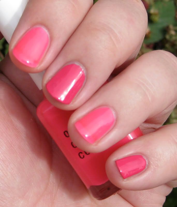
Pageant is on the pinky/middle fingers, Anime is on the ring/index fingers and in the bottle. I did two coats of each one, partly so you could see the difference in opacity as well as color, and partly because the second coat of Anime was a bit too thick, so I was afraid of messing it up if I did anything more to it. As you can see, Anime is much sheerer and more of a neon color (this is more apparent in the bottle than on my nails...the OCC site accurately described this color as "sheer, glossy day glo pink"). I'm not sure how many coats it would have taken to get it close to the opacity Pageant gave me.

Adding to the confusion is an OCC post on Scrangie that I saw before I did this experiment. The first color shown in that post is Pageant fka Anime (this was before the new Anime came out). Based on her swatch and description of the color, I'm now wondering if the original Anime, renamed Pageant, was named Anime once more and that the color of Pageant changed. o_O ...So confused. But they're both pretty. I really like Pageant and I'm wondering what Anime would look like over a white base.


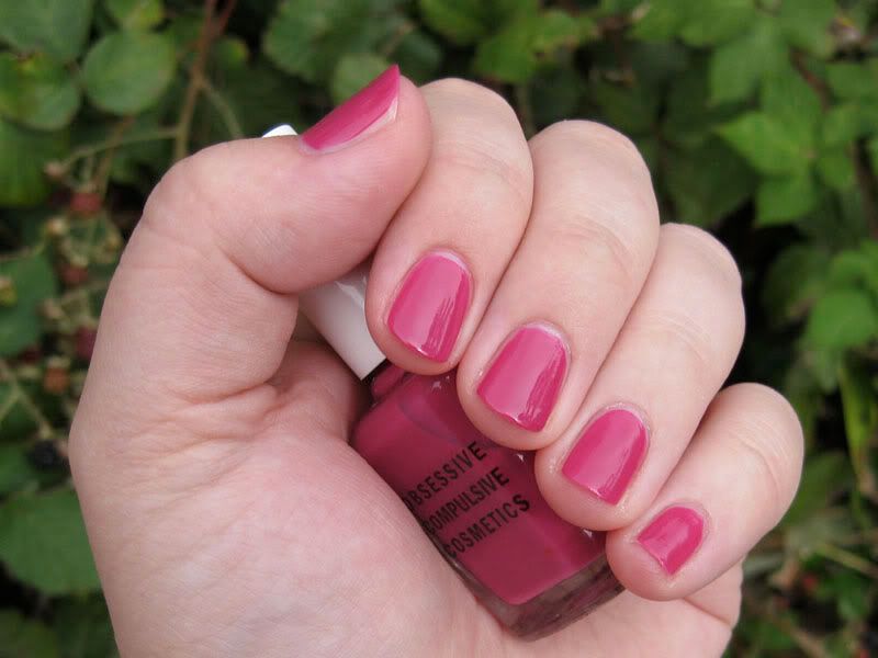
I ended up wearing another OCC color, Rhythm Box, over the weekend. Do not be fooled by the dot on their website! They describe this color as "pale bright violet"--the first thing I thought of when I saw the bottle was of red-violet Crayola crayons. A raspberry-ish color, if you will. The polish looks just a bit warmer in the large picture than it does in real life, though (and in the smaller picture here, it looks just about right--the heck?).

I didn't necessarily plan to do a bunch of pictures like this, but who knows? If it becomes a regular thing, I'll probably have to start watermarking since that's what everyone else seems to be doing. Not that I think my pictures are all that good, haha. I also took some pictures of random eyeshadow swatches over the weekend that I wanted to throw into this post, but I didn't get around to cropping them, so they'll have to wait.

Monday, August 17, 2009

Monday Makeup Madness: Still Kind of New to This Nail Polish Thing

I have quite a few bottles of nail polish in my collection, but I still feel like a novice when it comes to applying the stuff. But lately I've been doing it more frequently, so I think I'm getting better. Kind of. Most of the time I stick to the safe neutral-ish stuff, but I do love color, and since my work setting is pretty casual I can get away with whatever color I choose...so I'm starting to venture outside the box.

I recently broke down and got Sephora by OPI's Dark Room knowing the actual color wasn't even close to what was displayed on Sephora's site (Scrangie and The Nailphile have posts that shows the color much more accurately). On a side note, I find it hard to trust swatches on Sephora's site. I remember buying an Urban Decay nail enamel way back in the day in the color "Perversion" because I thought it was navy blue (IIRC they only had the color swatches and not brief descriptions of the colors). Surprise! It was black. :P I kept it, though I only used it a few times. I actually like black nail polish, not because of my inner goth (which existed then and now), but because it reminds me of Russian lacquer boxes. /tangent

Er, back to Dark Room. I thought I'd like it from the way people were describing the color, plus I had a Sephora coupon, so I thought I'd give it a shot. I was going to wait until fall to try it out, but tonight I was in a dark-nail-polish sort of mood, so on it went! I like the color, it's not quite black, seems to have a green / blue / gray hint to it...it kind of reminds me of a blackboard (the slate type). However, I felt like I needed to add something to it, so I then used China Glaze Wireless Holographic Top Coat. ...Oh my. The combination seems to say--nay, scream "Outer Space Princess". I have not yet decided if this is good or bad. I'm so curious to see what it looks like in natural light...I'll take a pic tomorrow and update this post so you all can see too. :)

[update 8/18: Here we go--it was overcast in the morning (left), so I took another picture on my afternoon break at work when the sun was out. Click to see a larger version, and kindly ignore my cuticles.]

Saturday, August 15, 2009

re: today's Giants-Mets game

I'd just like to say that anyone who thought the HBP on Wright was intentional either didn't watch the game or wasn't paying attention. The game was scoreless at the time, there was a runner on first, no outs, and Cain had an 0-2 count on Wright. Why the hell would you intentionally throw at a guy in that situation? Anyway, Cain went on to pitch 7.1 innings and when he was taken out, he tipped his cap as he went off the field. One of the announcers--Mark Grace, I think it was?--immediately took offense to the gesture, thinking it was a response to the all the booing the fans were doing after the incident. I believe he thought wrong, though, as Cain was most likely tipping his cap to the crowd of Giants fans sitting behind the dugout. (Those living in the SF area may know that this NY trip was one of the big team vacation packages for the season.) So yeah, the announcer sounded like an ass to my ears. But maybe he saw the error in his words later on...I mean, they did acknowledge the group of Giants fans there when Molina homered, so maybe he realized something then. I can only hope. :P

[edit 8/16: It appears that I was wrong in my initial thought...now I think it was probably a combination of both, an acknowledgment to the Giants fans and a "yeah, I heard you" to the Mets fans. I'll admit my error, but I still think that announcer overreacted.]

And as I type this, Ian Kinsler just got hit in the head with a pitch. Gah. He immediately stood up, though, and seems to be fine, thank goodness. Looks like the HBP will be a big topic tonight on the sports networks. :/

I'll end this with a fun quote from the AP wrap of the game that I saw over on Yahoo!:

"Santana then hit Molina in the elbow, and Bochy argued that Santana should be automatically ejected. Manuel removed him for reliever Shawn Green while Bochy argued."

The pitcher's name is Sean Green. I had a feeling that someone would make that error, heh.

Monday, August 3, 2009

Monday Makeup Madness: Sephora Reviews Revisited

Previously on Framboise Noire, I wrote about an issue I had with some customers' reviews on the Sephora website. Well...at least that group of people actually wrote about the product in their review. Recently I've been coming across people leaving low reviews of a product not because they didn't like it, but because it wasn't readily available. See, for example, the following "review" left for Sephora by OPI's Dark Room:

"So I love getting Sephora e-mails to get the latest updates on what's new. I was super excited to see this beautiful color and went to the store the same day. To my disappointment our Hawaii store does not carry it and I was told would need to wait 2 weeks! I really think our stores should carry it especially when it is advertised in the e-mail."

Seriously, people? This is not the way to properly complain. How about something like leaving a comment on their facebook page? That makes more sense to me. More recent reviews for this particular color make sense, as it apparently does not match the color displayed on the website. Looking at the bottle there made me think it was slightly darker than OCC's Blackboard nail enamel, but I guess it's even darker than that...hmm. Another color that has had a ton of comments along the same vein as the above quote is 212-Sephora, but those are more, um, "ranty". The color is limited and apparently popular, so when they get stock for it, it's going to go quickly. Everyone needs to chill. :P Here's what I consider a good review:

"I have maybe a hundred nail polishes, and this just made the #1 spot. It's got so many different kinds of sparkle and glitter, but not in a god-awful teenage way. It's a little translucent on its own, so I layered it over a black creme for the best effect. It is also very cute on my boyfriend's toes!"

Okay, the last sentence was a tad TMI for my liking, but hey, to each their own, plus it gave me a good idea of what the color was like and whether or not I'd want it. It sounds really pretty, so if I happen to see it around I might snap it up. Not that OPI's cheap or anything (unless you know where to go, though that doesn't apply to Sephora's colors), but they are a good brand. I have a nice little collection of them, so maybe that'll be next week's post...